Usability study and feature redesign suggestions - Khan Academy iOS app
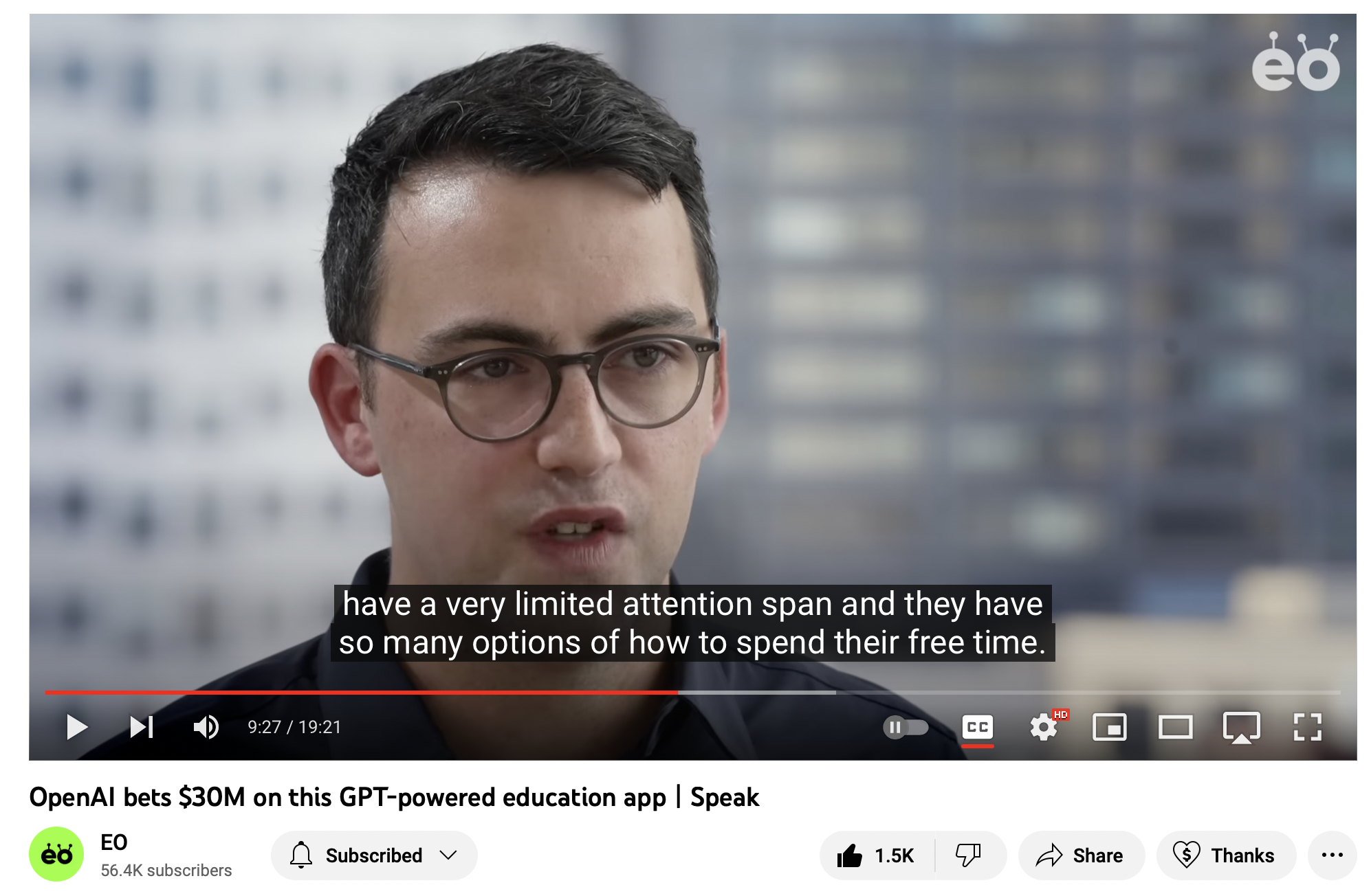
Why it’s a must for educational apps to have a smooth user experience
Currently, I haven’t found a replacement for social media apps so I’m still stuck with it, even though it has started to annoying me. My hand hurts while I hold the phone, endlessly, scrolling on that beautiful infinite scroll.
It is important for an app to sustain the attention it has managed to grab in the first place. This sustenance can only come via smooth user experiences that doesn’t let the attention scatter.
My expectation
Now I want to have something better to do on my phone than just scrolling mindlessly. The mobile screen already has my attention and is also always accessible to me. There must be a better way for me as user to utilise this attention that has been grabbed by a screen and steer it to another direction.
I installed KhanAcademy on my phone hoping this will help me study relevant topics from my ongoing courses at college. I had previously studied via the desktop website and liked their content. Since I always have my phone around, I was hoping to browse through the content on my phone instead of my current habit of mindless scrolling.
My experience
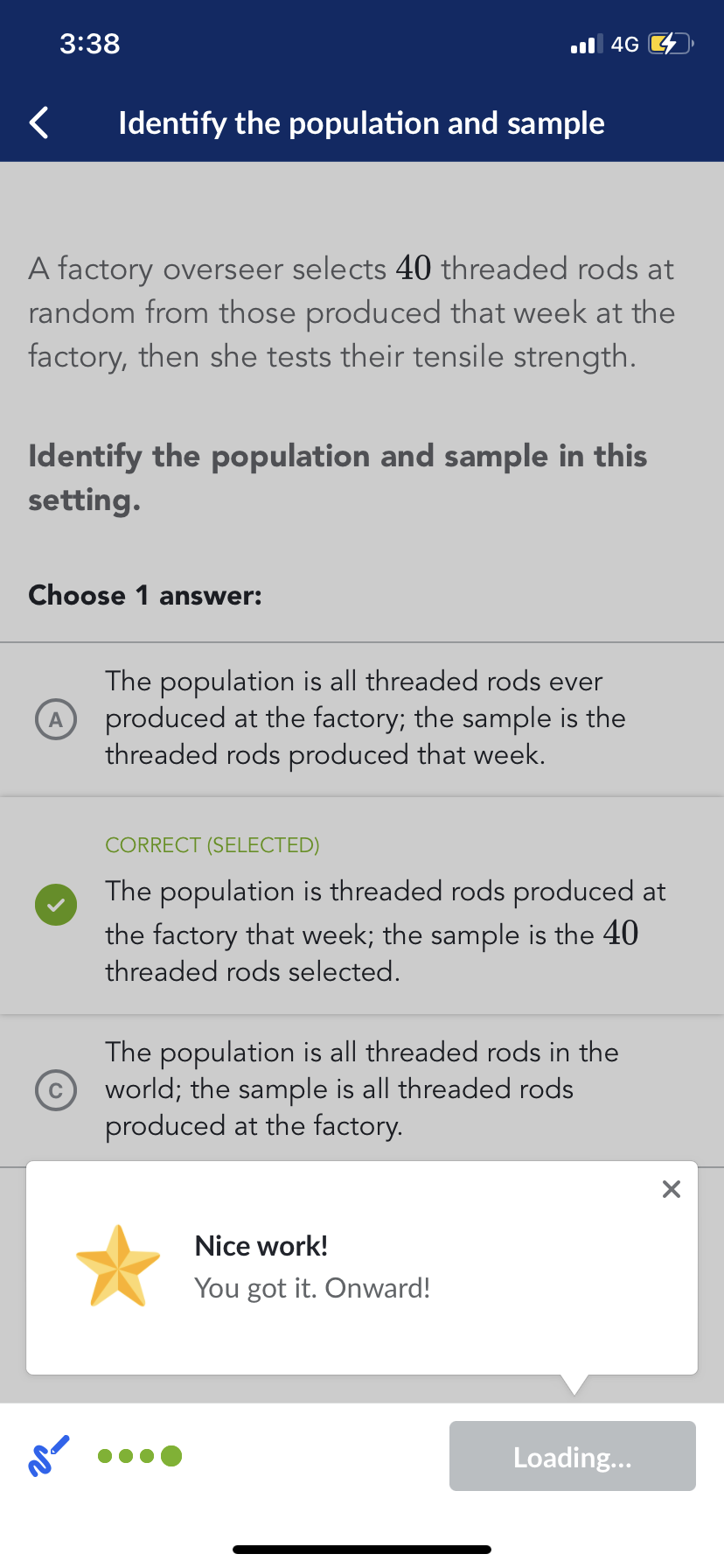
I had to revise “Research Design” and after scrolling Instagram for hours, I slid open the KhanAcademy app. I had a good mindless momentum going on and it was already difficult to get out of that and start studying. Within 5 mins into the app, my experience started getting disrupted. I literally had to close the app and come here to rant. That’s how frustrated and distracted it got me.
Here I present few pain points and possible design solutions of the current KhanAcademy iOS (26/02/23) app.
Pain Points and Possible Design Solutions
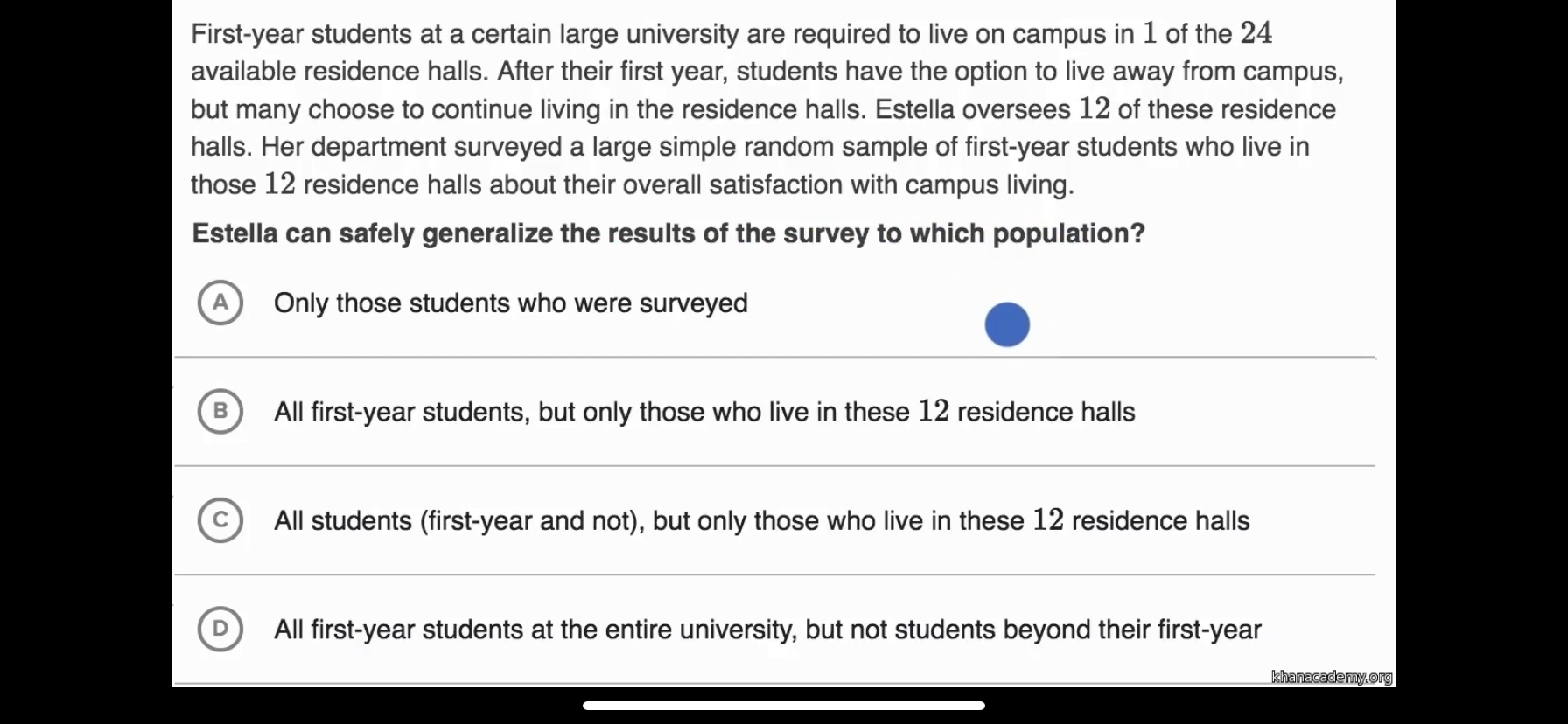
- Switching between content : I really wanted to understand experiment design for my assignment that is due day after. I can revise a lot of syllabus if only the content delivery was smooth.
I don’t have a button to go to next lecture here. I get this question and I want to quickly get to the next one. Just to move to next video, I have to minimise the video, go to the previous screen and select the next video. That a looong process. 💡Possible solution : The user persona is of someone who is used to the infinite scroll feature of social media apps. So it might make more sense to continue the swipe action on the content screen and transfer the muscle memory here on this app.
- Reward for answers: Reward after each correct answer- the whole process is slow. Just give me a good visible wholesome reward after sometime, but not after every question. My flow is getting broken.
Another approach could be introducing
Variable Reinforcement Schedule. VRS has been found to be very effective in maintaining behaviours over long periods of time. This is because the individual does not know when the next reinforcement will come, and so they continue to exhibit the behaviour in the hopes of receiving a reward. It is also harder to extinguish a behaviour that has been learned through variable reinforcement schedule, as the individual may continue to exhibit the behaviour for a long time even if the reward is no longer given.
Slot machines aren’t the only place we can use them 👆🏼
- Question Framing: Need a better, shorter way to frame questions. I don’t want to get intimidated by a long problem statement. Seriously, my heart beats go up.
Even in the case the statements cannot be shortened further, it might help to not display the entire text at one go and overwhelm the user. I
nstead display the text dynamically word by word, at an average reading pace which can help the user read the full thing.
Hand holding for difficult tasks like reading long texts helps make the experience more positive.